
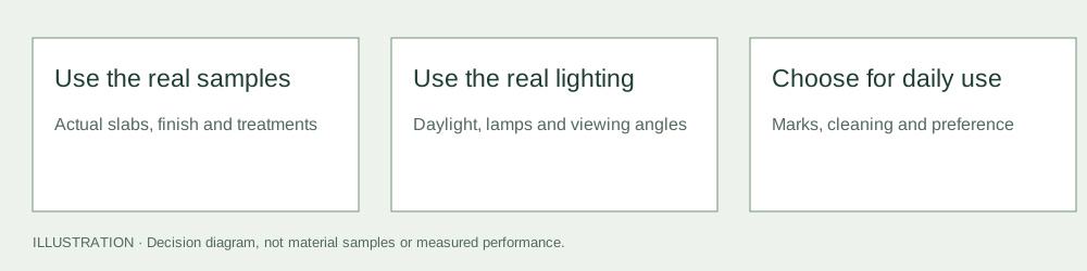
Choose light or dark granite by looking at the actual slabs in the room and accepting the marks and care that come with the chosen finish. Neither colour family hides every spill, fingerprint, mineral feature or reflection. The useful question is which surface you prefer after seeing it under normal use and lighting.
This is a colour-choice guide for natural stone. For a material change such as black granite versus white manufactured quartz, use the colour section of granite versus quartz. Changing both material and colour creates a different decision; it should not be reduced to a light-versus-dark preference.
Compare the actual range, not a colour label
The white granite record explains why a light family is not a promise of an evenly white surface. G603 and G654 are useful lighter- and darker-labelled starting points, but the records do not define the appearance of an offered lot.
Pizrog’s G603 entry and SRS’s G654 entry show how sellers describe their own materials. Obtain slab photographs and representative physical references from the supply actually being quoted. Do not use those examples to assume that a different seller’s code guarantees a match.
Look for grain scale, concentrated minerals, warm or cool areas, conspicuous veins and the range across the whole proposed top. A small sample can make a varied stone look more uniform than it will be in the installed layout.
Light and reflection can change the choice
Place the samples near the cabinets, wall finish and flooring, and inspect them in daylight and the room’s usual evening lighting. View from normal standing positions as well as angles that reveal reflections. A polished dark surface and a honed dark surface can read differently even when the stone is the same.
Ask the fabricator to show the proposed edge, seam location and slab orientation. A surface that looks quiet in a flat sample may give a different impression on a large island or a built-up edge. Use polished versus honed to separate sheen from colour.
Judge marks by contrast and cleaning reality
| Concern | What to compare on real samples | What not to assume |
|---|---|---|
| Dried splashes and pale residue | Visibility after ordinary compatible cleaning and drying | That a dark surface never shows water marks |
| Coloured spills or dark marks | The approved stone’s pattern and actual treatment | That light stone is automatically stained by everything |
| Dust and fingerprints | The same lighting and finish on both samples | That colour alone determines cleaning effort |
| Reflections and streaks | Window light, lamps and normal viewing angles | That a showroom photograph represents the room |
| Natural mineral features | Full-slab views and the retained appearance range | That uniformity follows from a light or dark label |
Do not damage samples to create a demonstration. Where a meaningful compatibility trial is needed, agree it with the supplier or specialist and use appropriate products on representative material.
The Natural Stone Institute’s care guidance starts with understanding the actual stone and using compatible cleaning. A busier pattern can change how a mark is noticed without changing whether the mark is present. Do not confuse a forgiving visual impression with permission to leave contamination or moisture indefinitely.
Keep sealing and treatment separate from colour
Identify any resin, enhancer, coating or sealer used on the slabs. Ask whether the sample has the same treatment as the intended supply. A darker appearance may be influenced by processing or treatment; do not assume that it proves a particular density or absorption value.
Use the sealing guide to decide whether a compatible treatment is useful for the actual stone and exposure. The water-drop screen is an observation tool, not a laboratory value or a universal treatment rule. Do not choose a colour on the promise that it will never need care.
Own use versus a resale story
Write down what you want to see and what cleaning you are willing to do. Consider the room’s lighting, the existing materials, how prominently the countertop appears and whether you value a quiet or visibly varied surface. Those are concrete preferences that can be reviewed against samples.
This page establishes no resale premium, buyer preference percentage or future market value for either colour family. If resale is material to the decision, obtain relevant local evidence rather than accepting a general claim that one colour always sells better. An uncertain future preference should not silently replace the needs of the person using the room now.
Approve the chosen range before cutting
Keep the selected slabs, finish, edge sample, treatment declaration and proposed seam layout together. Use slab-layout approval and Samples & approval to record what was accepted and which variations require another decision.
The final choice should be a specific supply and finish you have reviewed, not an abstract vote for light or dark. This guide has not tested your slabs or observed your room; it provides the comparisons that make that review more useful.
Questions & discussion
Share a question or a useful experience about this guide. Comments appear immediately. Your name and comment are public. Email is optional and stays private; reply emails are not enabled yet. Comment privacy.